Friday 30 November 2012
In
//
//
Leave a Comment
Lenovo Think Pad X1..reviews

If you have been a keen follower of technology, you will have heard companies talk either about legacy or innovation. Legacy entails carrying on what the company has been built on from the very beginning and innovation most often is the opposite – endeavouring to research and invent technology that hasn’t made it to the mainstream yet. While most manufacturers are now considered contemporaries, there are a few companies who have been in the field for much longer than the others. IBM is one of them.
Lenovo, after acquiring IBM’s personal computing division about seven years ago, has tried to make the most of the latter’s legacy while keeping the current consumer demands in mind. The newly introduced ThinkPad X1 Carbon, in India, seems like a product born of this philosophy.
Aesthetics
There’s no doubt about the fact that this is clearly one of Lenovo’s most high-end products in the market right now. And the company seems to have designed the X1 Carbon with enough traits to indicate the same. As the name suggests, the Ultrabook is encased in a carbon fibre top cover and a roll cage. At a press event in Tokyo, earlier this year, the company had explained its choice of carbon fibre over materials such as aluminium by stating that it was just as strong and about a third as light. During the review we could attest to the company’s claim that this is one of the lightest 14-inch Ultrabooks you can find out there today. It’s some sort of a relief to find out that you can carry a 14-inch laptop around with just one hand. The form factor of the X1 Carbon too has been designed to look extremely compact and sleek. The Ultrabook is just about an inch at its thickest. Even if the dimensions are slightly bigger, it certainly doesn’t seem so, with the classic black body masking the “extra inches”.
The laptop is powered by a proprietary rectangular plug-in. There’s a physical master control for all kinds of wireless activity that you might want to engage in. A small flip button on the left lets you turn all the wireless connections on or off at a given point of time. We don’t see why this was necessary because the hot keys already give you an option of alternating between switching the Wi-Fi, Bluetooth or both off from the keyboard itself.
There’s a small key above the keyboard which takes you away from the usual Windows desktop view. The new user interface is designed to resemble that of a tablet’s with app icons adorning the 14-inch screen in a colourful matrix. Facebook, YouTube, Wikipedia, Evernote, Skype and MTV remain some of the many apps pre-installed in this mode. Each screen is termed as a ‘Workspace’ by Lenovo and you can download or delete apps from these screens. The Lenovo Store, an app shop for Windows, is where you can download more programs from. The choice while not as endless as on smarpthone app stores, includes popular games such as The Sims 3, utility programs such as McAfee Total Protection and much more for you to buy.
Display
The 14-inch display on the X1 Carbon comes with a 1,600x900 pixels resolution. The screen is matte, making it a more enjoyable display than a glossy one where I have to watch as much of my reflection as the movie that’s playing on screen. The screen size too just seemed perfect for me. I prefer to carry my laptop around a lot and 15-inch or more sometime becomes too bulky and a 13-inch too small to enjoy media on it.
If the X1 Carbon was crafted during an age of pets of bards, the keyboard would easily have managed to have had a eulogy or two written about it. I mean, ThinkPads are known for their uber-comfortable keys, but the one laid our across the ThinkPad X1 Carbon is just something else. Not only is there ample room for your fingertips and ideal space between two keys, the travel too seems just perfect while you type away on the machine. Coming a close second is the butter-smooth matt touchpad below the keyboard. Every once in a while I had to stop and check to believe how satiny it felt to touch. The fact that it is glass-coated is also not too obvious.
The audio through the speakers is enhanced by Dolby Home Theater v4. In the past we haven’t been impressed with the audio quality on a lot of Lenovo’s ThinkPads, but the speakers on the X1 Carbon do manage to deliver pretty decent sound. For starters, we’ve always come across abysmally low volume levels on most ThinkPads but the X1 Carbon remains an exception. The physical volume controls come handy while watching a movie or listening to a couple of tracks every morning. You probably won’t have to plug in an extra pair of speakers to make the most out of this one. A small tweak that the company has integrated in the X1 Carbon is that, the noise generated by keystrokes while typing is kept real low, more so if you are engaged in a audio chat or video conference on the laptop.
Security
Targeted at business buyers, like a big chunk of the ThinkPads are, the X1 Carbon comes with a range of features to secure it from data theft. For physical protection, the laptop sports with a finger-print reader that you can activate and, in the process, deny others access to the workstation. It also has in-built BIOS encryption that will let you disable all input and output ports remotely without any additional hardware. We could also activate the ‘USB Blocker’ to identify and block different types of USB devices connected to the system, thus keeping it relatively safe.
Performance
The NovaBench score average, after running the test a couple of times, was around 614. The system we reviewed was running on an Intel Core i5 processor with a 4GB RAM. While we could not test out any games on the laptop, the couple of movies and high-def videos that we watched on the X1 Carbon, the graphics were rendered quite well.
Considering it’s a business laptop, Lenovo has integrated two features Rapid Connect and Rapid Charge. The former lets you connect instantly to the Web as you wake the laptop up from sleep and the latter turbo charges the X1 Carbon when it’s low on charge, taking it from zero to 60 per cent of battery power in about 30 minutes.
We say
The X1 Carbon is one of the most elegant-looking laptops you’ll comes across in the market. And you get the crisp, minimalist build without having to compromise on the screen size or the keyboard. On the contrary, these two turn out to be some of the best features that the X1 Carbon is endowed with. If you have no qualms about shelling out the big bucks, the ThinkPad X1 Carbon is one of the most well-designed and efficient workstations you can get your hands on.
Rs 85,000 onwards
In
//
//
Leave a Comment
HTC's Windows Phone 8X, Nokia Lumia 822 ship November 13
HTC's Windows Phone 8X, Nokia Lumia 822 ship November 13..

Verizon Wireless is launching not one, but two Windows Phone 8-based devices next week.
The company announced on its site today that the HTC Windows Phone 8X and the Nokia Lumia 822 will both ship on November 13.
The HTC Windows Phone 8X comes with a 4.3-inch display and 8-megapixel rear-facing camera. The device comes in the customer's choice of blue, red, or black. The handset can connect to Verizon's LTE network and comes with 16GB of onboard storage. It will retail for $199.99 with a two-year contract.
The Nokia Lumia 822 is a bit cheaper than the HTC option, coming in at $149.99 with a two-year deal. Online shoppers get an additional $50 discount on the Lumia model that brings its price down to $99.99. For that, customers get a device featuring a 4.3-inch screen and 8-megapixel rear-facing camera. Like the HTC option, the Lumia 822 can connect to the Web via LTE and has 16GB of internal storage.
Verizon announced pricing on its new handset line yesterday. The company noted that the devices would ship next week, but didn't provide an actual release date at the time.
CNET's Reviews team recently examined the HTC Windows Phone 8X and awarded it four stars out of five, saying that it's a "smart choice for anyone ready to dive into the Windows Phone OS."
Tuesday 27 November 2012
In
//
//
Leave a Comment
Use Windows 8 Themes with Previous Versions of Windows
Use Windows 8 Themes with Previous Versions of Windows..
The official Windows Themes directory at windows.microsoft.com hosts some beautiful themes for your Windows desktop. Some of the newer themes – like these dual-screen panoramic images – are however compatible only with Windows 8 machines.
If you aren’t planning to make the upgrade to Windows 8, the good news is that you can still extract the wallpaper backgrounds of these Windows 8 specific themes and use them on older Windows PCs.

The Windows theme files have a .themepack extension but the Windows 8 specific themes are distributed as .deskthemepack files. Internally, this is just another archive format that you can easily open using the free 7-zip utility.
Install the 7-zip utility and then download any of the .deskthemepack files from the Windows Themes gallery. Press F2 to rename the theme file and change its extension to .7z (you can just append .7z to the file name). Now you can right-click this files and extract the included wallpapers to your desktop.
Now you can either use these background individually or put them in one folder and then open Desktop Background under the Control Panel. Browse for the folder containing these pictures and select the ones that you would like to use on your desktop.
In
//
//
Leave a Comment
Apple against Samsung

Apple sought to add infringement claims over more Samsung products including the Samsung Galaxy Note 2 to its multibillon-dollar patent lawsuit against the South Korea based company..
Apple said that the Samsung products running on the new Android" Jelly Bean", operating system and the other products running on "Ice-Cream Sandwich" system should be added to the case, according to the filings in San Jose federal court in California. Jelly Bean is Google's latest version of Android OS that run on Samsung Devices...
Apple, on November 23, asked the courts to add to its case, Galaxy S III, running thew new Jelly Bean system, the Galaxy Tab 8.9 wi-fi tablet computer and the Galaxy Tab 2 10.1 and the Rugby Pro and Galaxy S III mini..
These claims were filed as a part of the second patent suit between the mobile devices giants in San Jose federal court in which Samsung is targeting Apple iphones, ipad and ipod Touch devices, while Apple has named more than 20 Samsung devices.
Friday 23 November 2012
In
//
//
Leave a Comment
New technology can allow governments to hear conversations on Skype
New technology can allow governments to hear conversations on Skype
New eavesdropping technology could allow government agencies to
'silently record' conversations on internet chat services like Skype.
Until now, so called voice over internet protocol (VoIP)
services have been difficult to tap into, because of the way they send
information over the web.The services convert analogue audio signals into digital data
packets, which are then sent in a way that is costly and complex for
third parties to intercept, the 'Daily Mail' reported.
But now a California businessman has obtained a patent for a 'legal intercept' technology he said "would allow governments to "silently record" VoIP communications".
Dennis Chang, president of VoIP-PAL, a chat service similar to Skype, claims his system would allow authorities to identify and monitor suspects merely by accessing their username and subscriber data, the paper quoted Slate magazine as reporting.
According to the patent, they could also be tracked down by billing records that associate names and addresses with usernames.
Such a capability would make not only audio conversations but 'any other data streams such as pure data and/or video or multimedia data' open for interception.
Internet users who are paranoid enough to use false subscriber data and services to mask their IP addresses could be able to circumvent the identification.
Chang's patent could restructure the way VoIP data is sent over the internet to make it much easier for authorities to track calls.
The expansion of 4G mobile networks, which can carry large amounts of data, have made it easier than ever for people to make cheap VoIP calls almost anywhere and the number of mobile users of such services is expected to reach 410 million by 2015, the paper said.
In response the increasing popularity, the UK, US and other countries have sought to compel VoIP providers to install technology that would allow 'lawful interception' of conversations.
The patent filed by Chang's company marks just one entrant into a battle to capitalise on this race to provide the next generation of online surveillance technology.
Originally filed in 2007, it was followed two years later by a similar patent by Microsoft - owner of Skype - to 'silently copy communication transmitted via the communication session'.
Sunday 18 November 2012
In
//
//
Leave a Comment
LG Google Nexus 4
LG Google Nexus 4..
While the LG Nexus 4 wins on internal performance and user experience, anyone shopping for an unlocked phone should consider a comparable LTE handset first.
| The good | Competitively priced; delivers a pure and polished experience with Android 4.2 Jelly Bean; is powered by a snappy quad-core processor; packed with new photo-editing and camera features. |
|---|---|
| The bad | Construction is solid but uninspiring; call volume is too low, lacks 4G LTE. |
With its recent history of mediocre handsets, LG needs something other than the Optimus G to be its Hail Mary that can carry it to the top. Unfortunately, the Nexus 4 isn't quite it.
Don't get me wrong, the device itself performs excellently, and some of the specs are certainly impressive: the quad-core CPU is swift, the Jelly Bean Android OS runs as smooth as butter, and all the subtle new features work well without being too unintuitive or burdensome.
But Google's flagship phone is missing one huge feature that caught us all off guard. The Nexus, which is supposed to represent Android in its most modern, so-high-tech-that-it's-on-the-bleeding-edge form, isn't 4G LTE-enabled.
Instead, it operates on "4G-ish" technology (GSM/HSPA+), and comes unlocked from Google (starting on November 13, the 8GB and 16GB versions will be US$299 and US$349, respectively) or on T-Mobile (after signing a carrier agreement, the 16GB model will be US$199 and will begin selling the day after). If your carrier is T-Mobile you won't care much, since the network runs on HSPA+ anyway. But for those who had been planning on buying the unlocked model and using it on, say, AT&T's 4G LTE network, the news is truly a downer.
Truth is, while HSPA+ can be as fast as LTE, for the average consumer LTE is expected on high-end phones. Jelly Bean and the pure Android experience will be important for OS enthusiasts, but this phone should have had both. And yes, I know the Galaxy Nexus didn't have LTE, either, when the technology was available. I was disappointed then, too, even though the network wasn't as robust. But now that LTE is so widespread, the Nexus 4 shouldn't get a pass. A handset this high-caliber should have LTE capability, especially these days, when so much time has passed since LTE's launch and even midrange devices come with it.
Design

If I were to sum up my impression of the LG Nexus 4's look in one sentence, it'd be this: Even though the smartphone has LG's logo slapped on its back, it has Google written all over it.
Don't get me wrong, you won't see Andy anywhere on the handset, nor will you see any blue, red, yellow, and green lettering. But the device's design noticeably lacks LG's past aesthetic..
Gone are the bezel hot keys that light up when in use, and there's no physical home button. Instead, the shortcut keys for back, home, and recent apps appear on the screen itself, just like they do on the previous Nexus. Also gone is the straight-edged touch screen. In its place is a display that softly curves into the bezel, which adds that luxurious extra oomph, and it's something I'm a huge fan of.
Lastly, the top and bottom edges of the Nexus 4 curve outward, giving the device gently rounded corners. This is a welcome departure from LG's recent string of mid- to high-end smartphones that were sharply rectangular and austere.
Not everything looks great, however. The phone's edges are coated with a matte plastic, rubbery material, and they turn inward at a sharp, jagged angle. And if you want to access the inside, you'll need to use a tiny screwdriver, which will be inconvenient for some.
Overall, the design is nothing we all haven't seen before. Yes, the Nexus 4 does look and feel like a premium handset, but it's uninspiring. It measures about the same as most big, 4.7-inch phones (133.9 x 68.7 x 9.1 mm), so it'll be a tight squeeze in small jean pockets. It's a wide fit in the hand but is comfortable to hold, and while it's only 0.2 ounce (5.7g) heavier than the Samsung Galaxy S3, it feels noticeably denser and sturdier..
| Phone | LG Nexus 4 | LG Optimus G | Samsung Galaxy S III |
|---|---|---|---|
| Height | 133.9 mm |
131.9 mm |
136.6 mm |
| Width | 68.7 mm |
68.9 mm |
70.6 mm |
| Depth | 9.1 mm |
8.45 mm |
8.6 mm |
| Screen | 4.7-inch |
4.7-inch |
4.8-inch |
| Weight | 139g |
145g |
133g |
On the left is a volume rocker and up top is a 3.5mm headphone jack. The sleep/power button.is on the right spine, and the Micro-USB port is on the bottom edge. Above the display in the top right corner is a 1.3-megapixel camera and below the screen is an LED notification light. The back of the phone houses an 8-megapixel camera and an LED flash. Now, about that distinctive sparkling back plate: Personally, I don't mind it. You can only really see it in the light, and it reminds me of either Tetris or "The Matrix" (two things I'm fond of). There are others, however, who don't like it and say it makes the phone look like a "Sailor Moon" sticker card..
Features
Display
Though the LG Optimus G and the Nexus 4 have the same 4.7-inch True HD
IPS+ touch screen with the same 1,280x768-pixel resolution, and both are
made out of Corning Gorilla Glass 2, the usable screen space on the
Nexus 4 is actually smaller because of the onscreen hot keys. Sure, the
icons move out of the way when you're watching videos or playing games,
but that third of an inch of lost screen space (especially given that
the two devices are nearly the same size) is noticeable when browsing
the home screen or surfing the Web.
Having said that, however, the screen is still impressive--it's bright, text renders crisply, colors are true to life and vivid, and it's sensitive to touch input. Something about swiping my fingers across it and letting them fall off the edges felt incredibly slick. Even the slightest touch will register, without being inaccurate, and typing with Gesture Touch (more on that later) was exceptionally smooth.
Understandably, on the Optimus G and and the Nexus 4, photos and videos looked practically identical. There were a few times when colors on the Nexus 4 had warmer tones and less contrast, but these instances happened so rarely that it's difficult to make a call between the two.
On the other hand, differences compared with the Samsung Galaxy S3 were much more prominent. Colors on the Galaxy S3 were more saturated, greens looked deeply green, and whites had a subtle blue hue to them. Dark colors, like black and brown, were harder to distinguish from one another. Though there were times when the richer palette made photos and videos look better on the S3, the Nexus 4 displayed colors that were truer to life without being muted.
Interface and basic features
Unlike the overhaul that was the change from Android Gingerbread to
Honeycomb to Ice Cream Sandwich, the change from ICS to Jelly Bean is
subtler. In general, the aesthetics of the UI remain about the same:
Roboto is still the dominant font, menus and icons keep the same
minimalistic look, and the elegant simplicity of ICS is retained
overall. In fact, only hard-core Android devotees would be able to tell
it wasn't ICS even after spending a few minutes with it.
However, the minor changes that are present are welcome, such as resizable widgets; a more expansive notifications bar that lets you see more information about things like e-mails, texts, and screenshots; offline voice dictation; more wallpapers; updates to Google Play; and updates to Android Beam, which now allows you to transfer more-complex files like photos and movies over NFC.
Another feature is Google Now, which is closely tied into Google Search and Voice Search. Because Google Now isn't technically a voice recognition service, it's not like iOS' Siri. But it does have voice assistant-style abilities. For instance, it can suggest local restaurants and estimate your commute time.
Basic features include a calculator, a calendar, a clock with alarm functions (with an extremely beautiful interface, I must say), an e-mail client, a movie-editing app, and a news and weather app. And all the Google apps you come to expect are preloaded: Chrome, Currents, Earth, Plus, Search, Local, Maps with Navigation, Messenger, Talk, Voice Search, YouTube, and the Google Play Books, Magazines, Movies and TV, Music, and Store portals.
Android 4.2: What's new for Jelly Bean?
Right when I turned on the handset, it prompted me for an update to version 4.2. This brought a few more features, most of which involve the camera (I'll expand on that later). Another feature is Gesture Typing, a typing input method that's similar to Swype. Swype is a third-party app that allows users to swipe through the letters to form the words they're typing out, instead of hitting individual keys. It's a faster, more convenient way of typing that's rightly loved by Android users. Gesture Typing is a native feature that works in the same way
There's also Daydreams, a sort of screensaver sleep mode for your phone whenever it's docked or charging. Options include a graphic of floating jelly beans you can interact with through touch, a mural of headlines gathered from your Google Current subscriptions, or a shifting color gradient. In addition, photos from your albums can be displayed, either individually or piled on one another like a stack of physical pictures.
Camera and video
Shooting options and editing: The LG Nexus 4's 8-megapixel camera sports
a new user interface that is now even more minimalist than the previous
Nexus iteration. Photo options can be reached through a radial dial
that you can access by either tapping on the circle on the right-hand
corner, or tapping anywhere on the viewfinder itself.
These options include flash, geotagging, and 3.9x digital zooming, five white-balance modes, five scene modes, seven photo sizes, an exposure meter ranging from -2 to +2, and HDR shooting. You also get touch and autofocus. The front-facing camera retains most of these features save for the flash (obviously), and there are only three photo sizes to choose from.
In addition, you can take panoramic pictures and Photo Spheres, a new feature in Android 4.2. Photo Sphere stitches together pictures taken from every angle at a single point, to create expansive 3D-esque photos. Though you need to spend some time to take all the photos, the spheres never fail to impress people, and they're great when you want to record and share an all-encompassing scene, like when hiking or buying a new house. Though I had a little trouble figuring out how to use it in the beginning, the feature works reliably and swiftly. There were a few times, however, when the feature didn't allow me to capture the very bottom and very top of a scene, which resulted in huge black holes of empty space in my photos.
Aside from the exposure meter, rear-facing video features consist of the same options. However, there is an additional time-lapse mode and you can select from three video qualities, the highest being HD 1080p. If you want to record with the front-facing camera, the highest quality you can shoot in is HD 720p.
The photo gallery also went through a makeover. You can browse through photos in a filmstrip view by slightly pinching in on an individual picture. To delete a photo, simply flick it off the screen. To edit an individual image, select the icon of three intertwining circles at the bottom of the display.
Editing options include 10 lens filters, not unlike the
ones Instagram offers. You can also overlay seven different types of borders, crop a photo, or adjust sharpness, exposure, contrast, hues and saturation levels, and much more.

Performance
Call quality: We tested the device on T-Mobile's network. Signal quality both indoors and outdoors was great. I didn't hear any audio clipping in and out, no calls were dropped, and I didn't hear any extraneous buzzing.
Call quality, however, was a different matter. Every test call I made was to a landline phone, and for the in-ear speaker, audio volume was too low. There were times, especially outdoors, when I couldn't make out what my friends were saying, even after cranking it up to maximum volume. Switching to speakerphone helped a little, but if I turned the volume too high, voices sounded extremely harsh. This makes sense since sound can only escape through a thin slit in the back of the phone, so my friends sounded really tinny while speaking. The speaker also rendered music flatly. Its small opening strips away much of the depth and body, especially from songs that are instrumentally rich.
Furthermore, even in regular (not speakerphone) calls, voices sounded slightly staticky, and every word I heard was layered with a subtle fuzz. Likewise, a friend reported to me that I sounded too sharp, as if the bass was turned down on my voice while the treble was turned up.
Whether the lack of LTE matters: If you're a T-Mobile customer, the answer is no. T-Mobile's "4G" was always based on HSPA+ technology and it never offered LTE, anyway (though the carrier does plan on launching it next year). So for those of you who belong to the carrier now, this handset is one of the best phones T-Mobile is offering.
On average, it loaded our CNET mobile site in 6 seconds and our full desktop site in 8 seconds. The New York Times mobile and desktop sites took 7 and 14 seconds to load, respectively. ESPN's mobile site downloaded in 7 seconds, and the phone took 15 seconds to load the full site. It took a mere 50 seconds on average to download the 22MB game Temple Run. And the Ookla speed-test app showed me an average of 8.15Mbps down and 0.5Mbps up.
However, if you buy the phone unlocked, you won't be able to use any carrier's 4G LTE network. As I stated before, LTE has become a staple in mid- to high-end phones and the technology is no longer in its infancy. And while some surmise that operating on GSM/HSPA will make the Nexus 4 a more global device, it's still a letdown for the US market.
Processor and battery: Though the Nexus 4's data speeds might not be blazingly fast, the 1.5GHz Qualcomm Snapdragon S4 Pro quad-core CPU makes its internal speed swift and smooth. Graphics-intense games like Riptide GP and Asphalt 7 played extremely well, launching and running with no stalls or hiccups. The games both displayed high frame rates with high-resolution graphics.

(Credit: Josh Miller/CNET)
In addition, average start time for the handset was about 23 seconds, and it took about 1.82 seconds to launch the camera. Browsing on Chrome was a lot smoother on this device than on the Optimus G for some reason. For instance, scrolling down Web pages was executed much more swiftly.
Although I haven't finished our battery drain tests, anecdotally the handset had short battery life. Though it's powered by a 2,100mAh battery, the screen takes much of its reserves. I needed a few good charges to get me through the day, and playing a 22-minute show drained about 10 percent of the battery's power. According to FCC radiation standards, phone has a a digital SAR rating of 0.56W/kg.
Conclusion
In general, the device is excellent and reliable--its internal speeds are zippy and smooth, the camera is packed with new features, and Android 4.2 is indeed sleek. The Nexus 4 is one of the best LG phones out there alongside the Optimus G, and for such a recognizable phone, it's extremely affordable. In addition, if you're already a T-Mobile user, the Nexus 4 is the carrier's best offering next to the Galaxy S3.
But aside from natively sporting Android Jelly Bean, the Nexus 4 doesn't offer up anything significantly new. If you ask yourself, what does this phone do to expand and progress the Nexus brand? The answer is, nothing much.
Though it's fast, the Optimus G also has a quad-core CPU and the AT&T model is 4G LTE-capable to boot. Compared with the Samsung Galaxy S3's design, the Nexus 4 looks all too common. And if you're concerned about what Google said about LTE and battery life, look no further than the Motorola Droid Razr Maxx HD. Plainly put, while the Nexus 4's HSPA+ speeds are respectable, its lack of LTE capabilities will definitely leave users feeling behind or slighted
Tuesday 13 November 2012
In
//
//
Leave a Comment
Windows 8 Review
Windows 8 review
It's unusual, to say the least, for us to spend a year with a product before publishing our review. In the case of Windows 8, we've written thousands of words already, starting with our first hands-on in September of 2011, followed by deep dives on the Developer Preview, Consumer Preview, Release Preview and RTM build. Even our readers have had ample time to get acquainted with the OS -- it's been available as a public download since February. And yet, we've never tested a final version of the software running on brand new, made-for-Windows-8 hardware. With the OS now on sale (alongside dozens of new PCs), it's finally time for us to double back and revisit everything we've previously written in the form of a final, comprehensive review.
And what a challenging assignment this was: it's hard enough to give an OS the full review treatment without burying the reader in minute details. It's even tougher when the software was built for so many different kinds of hardware. Combining a traditional desktop with Windows Phone-inspired Live Tiles, Windows 8 was designed to be equally at home on traditional PCs and more finger-friendly devices, like tablets and hybrids. In addition to walking you through the operating system's various gestures and built-in apps, then, we'll spend some time talking about which form factors are best suited to this redesigned version of Windows. Read on to see what we found out.
Table of contents
-
Getting started
-
User interface
-
Lock screen
-
Desktop
-
Built-in apps
-
Windows Store
-
Accessibility
-
System requirements
-
Pricing and versions
-
Wrap-up
Getting started
It's all about the cloud
The whole boot-up sequence takes not a minute, but just 20 seconds in some cases.
We can remember when we first started using Windows 7; the start-up sequence wasn't that different from Vista, which in turn wasn't unlike versions of Windows that came before that. The chain of start-up screens could be long, sometimes taking more than a minute to complete. Depending on how slow the system was, it could have taken a while longer for the desktop to fully load. Here, booting Windows feels like turning on an Android tablet, or some other mobile device. The whole process takes not a minute, but just 20 seconds in some cases -- a short sequence marked by a brief splash screen and redesigned Windows logo. If this is your first time starting up your Windows 8 machine, you'll see a 30-second video tutorial explaining some of the controls that otherwise might not be so obvious -- the so-called Charms Bar which you pull out from the right side of the screen, for example. (We'll circle back and explain all those new user interface elements in just a moment.)
From there, getting set up is a quick, painless affair. When you first boot up Windows 8 you'll be prompted to sign into your Microsoft account. Yep, the same one you might already be using for Hotmail, SkyDrive and Xbox Live. That means that every time you sign into a Windows 8 PC, your settings and custom tweaks will follow you to that new device. Additionally, because your Microsoft account is linked to your SkyDrive storage, you'll be logged into SkyDrive on any Windows 8 device where you've logged in using your Microsoft ID. So, because Office 2013 backs up to SkyDrive by default, it means any document you edit on your Windows 8 device will automatically upload to the cloud.
If you didn't already have a Microsoft account, you can create one while you're setting up your PC. You can link your account at any time, really, and you also have the option of disconnecting it (in Microsoft's words, "switching to a local account"). Naturally, too, you can add multiple user accounts, as you could on previous versions of Windows.
If you like, you can also cherry-pick which settings do and do not get synced across your various Windows 8 devices. Go into the settings menu, for instance, and you can use on-off switches to sync your settings for desktop personalization, accessibility, language, app and browser settings. You also have the option of syncing your lock screen, account picture and other Windows settings, like those relating to File Explorer or the mouse. Note: to have your passwords follow you from PC to PC, you'll need to "trust" the computer through an online verification process.
Security options

Obviously, if you log into Windows 8 for the first time using an existing Microsoft account, you've already got a built-in password for your PC. But in addition to a standard password, you can use a four-digit numerical pin to unlock the device. What's more, with Windows 8, Microsoft is also offering a new "Picture password" option that allows you to pick any photo and make a series of gestures on it. You can make as many gestures as you want, but they do have to be taps, circles or swipes. In addition to the order, though, you'll have to remember where on the picture you're supposed to make each gesture.
We had mixed success here. On the one hand, when we set our password to be one tap in each corner of the picture, we were easily able to replicate this pattern, even if we didn't hit the exact same pixels each time. Still, when our password was a diagonal slash across each corner, we struck out trying to draw the lines in the same spot we did initially. Fortunately, as you're configuring your picture password you'll be asked to repeat the pattern, so if you can't do it then, that might be a sign you need to come up with something else.
User interface
Redesigned Start Screen, and the end of the Start button
It's safe to say the Windows Phone-esque Live Tiles have been the single most polarizing thing about Windows 8. Which makes sense: the new, mobile-inspired Start Screen looks wholly different from anything we've seen on previous versions of Windows. What's more, you can't even interact with these apps the same way: they run at full-screen, and can't be minimized or re-sized like the windows you're used to. In short, these tiles are the cornerstone of the Windows 8 experience, and they're impossible to avoid, even if you plan on doing much of your work in the traditional desktop.
As you've probably heard by now, the Start button is no more. Well, it's there, but you'll have to hover with your mouse in the lower-left corner to make it appear. So, it's exactly where you'd expect it to be; it's just hidden until it's clear you need it. And what if you're using a touchscreen PC, like a dockable tablet? Your device will almost certainly have a dedicated Start button, the same way every Windows-compatible keyboard has a Start key. You can also find a shortcut to the Start menu in the Charms Bar, which you expose by swiping in from the right side of the screen. Not being able to click on the Start button is an adjustment, to be sure, but we're also confident you'll fall into a rhythm pretty quickly. After all, hovering where the Start button used to be isn't that different from clicking it, and hitting the Start key with your pinkie feels natural as well.
When Windows users say they wish Microsoft hadn't axed the Start button, what they're really nervous about is the fact that the Start Menu is presented so differently. When you hit the Start key, you'll no longer see a stack of fly-out menus; instead, you'll be whisked away from the desktop to a full-screen assortment of finger-friendly Live Tiles, which you scroll through from left to right. In other words, that minimal, unfamiliar screen is the new Start Menu.
Back when we first tried out the Developer Preview, we said it felt jarring to switch back and forth between the traditional desktop and this more tablet-optimized Start Screen. And it is -- if you've never used Windows 8 before. What we can say now that we didn't appreciate back then is that while the learning curve is steep, you do get comfortable after a while. No one is a dummy: everyone can, and will, figure it out. It just takes a little time before using Windows 8 feels truly effortless.
Universal search
We'd add, too, that once you master this new layout, there are lots of useful things about the OS that feel like clear improvements over previous versions of Windows. If you make the same pinch-to-zoom gesture you'd use to zoom in and out of web pages, you can shrink the Start Screen so that you can see all your pages of apps at once. As you can imagine, that's useful if you have a large collection of apps and don't want to page horizontally through eight home screens.
Additionally, once you bring up the Start screen you can start typing to search for something. As any Windows user will tell you, you can already more or less do this in Win 7, except here you don't even need to find a search bar. The results will immediately pop up on the right side of the screen. From within the search results pane, you'll see the results are divided into files, settings and applications. Admittedly, this method of search isn't obvious to new users, but again, you only need to learn it once. After that, it's quite convenient.
Charms Bar
We already mentioned the Charms Bar, which appears when you swipe in from the right side of the screen. Here, you'll find shortcuts for the Start Screen, settings menu, a list of connected devices, search and sharing. Lingering on that last point, sharing works much the same as it does on other mobile devices, which is to say if you've got some piece of content -- say, a Word document or a batch of photos -- you can share them in all sorts of way. This includes email, as well as Facebook, SkyDrive, Twitter and any other applicable service you've linked to your Microsoft account. Again, we're used to doing this on our smartphones and tablets, but it's a pleasure to be able to use a Windows PC the same way.
What's more, it's nice that all of these sharing and settings menus are easy to reach with your thumbs, even if you're using a large 11-inch tablet or a 13-inch convertible PC. The Charms Bar is one example of this: you can reach the settings and sharing menus while still cradling your tablet in a natural position. Moving on to the left side of the screen, you can swipe in from the left to toggle through open apps -- a feature known as Switcher. Each time you swipe, a different program slides into place, taking up the whole screen. Here, too, it's easy to control your device, even if you're holding a large-screen tablet and have your hands full.
You can also expose the Charms Bar using a mouse, though it's a less smooth experience. You'll want to hover on so-called hot corners at the upper- and lower-right portions of the screen. This can be frustrating, and definitely has a learning curve. If you're using a PC without a touchscreen, there's a good chance the trackpad has fresh drivers that allow you to replicate key Windows 8 gestures, like swiping in from the right to bring up the Charms Bar. We've also seen accessories like the Logitech Wireless Rechargeable Trackpad T650, which bring this functionality even to people whose older PCs don't support these gestures. Point is: this feature in Windows 8 is at its best when you have some sort of touch device at your disposal. Whether that ends up being a touchscreen or a gesture-enabled trackpad doesn't matter as much.
One other, potentially confusing thing: the Charms Bar holds the shortcut to system settings. If you're inside an app and want to see some options specific to that program, you'll need to perform a different gesture entirely: swipe the top or bottom of the screen to bring up that menu.
Multitasking

When it comes to switching apps, you can use that Switcher gesture, but there are other built-in features designed to make multitasking a bit easier. For starters, Snap allows you to dock a window or app so that it takes up either a third or two-thirds of the screen. That leaves room for a second app, which you can snap into the remaining space. That's actually quite similar to Aero Snap from Windows 7, except here the dimensions are in thirds, instead of half the screen. As in the Win 7 version of this feature, you can't manually re-size these windows: once they snap into place they're going to take up a predictable amount of space (i.e., one third of the screen).
Also, in Windows 8 you can mix up the proportions by sliding the border of a window across the screen. Say, for instance, you're working on a Word document on two-thirds of the screen, with IE 10 sitting off to the side. You might be spending most of your time typing in Word, but if you need to do a web search, you can just put your finger on the border between the two windows, and drag it over so that now the web browser takes up more space. It's also worth noting that you can mix and match traditional desktop programs and Modern (formerly known as "Metro") apps. In some cases, this can mean fewer jarring jumps between the desktop and more touch-friendly apps.
Snap is a trick you can pull off if you're using a touchscreen device or a traditional mouse and keyboard. Whether you're using your finger or a cursor, you need to drag down on the app from the top of the screen before it can be docked into place. If you are using a mouse, you can also hover in the upper-left corner of the screen to expose open apps. What you'll see isn't a list, per se, but a series of preview thumbnails -- miniaturized versions of whatever's going on in that window (your Outlook.com inbox, your SkyDrive home screen, et cetera). From there, you can click on a thumbnail to switch to that app, or you can right-click to close one. Like so many other features in Windows 8, this feels less clumsy with practice, though even after months of testing, we find the swiping Switcher gesture feels smoother, more intuitive.
Personalization options

To some extent, you can control the look and feel of Windows 8. No, there's no bringing back the Start button, but you can select different color themes for your Start Screen. Toward the end of the Windows 8 development process, Microsoft added so-called Personalization Tattoos -- essentially, Start Screen backgrounds with patterns and borders. So long as you're signed into your PC using a Microsoft account, this, too, will follow you to other Windows 8 devices you might log into. Get another Win 8 PC down the line, and it will show your paisley background as soon as you sign in for the first time.
Lock screen

In addition to the Start Menu, you can customize the look and feel of the lock screen. This includes the background photo, as well as which notifications are displayed. For instance, even without entering your password, you can see upcoming calendar appointments, as well as a peek at how many unread messages or emails you have. In the PC settings, you can also choose to display detailed information for one of two things: your upcoming calendar appointment, or the weather forecast.
Desktop
For the most part, the desktop should feel pretty familiar to Windows 7 users, especially compared to that redesigned Start Screen. Still, there are some differences here, too. For starters, the Aero UI is no more, which means windows no longer have a transparent border. Everything here is flat and two-dimensional, not unlike those new Live Tiles.
In a move that will please power users, Windows 8 also ushers in improved multi-monitor support, with the ability to display different desktop backgrounds on multiple displays, as well as have a single picture span those various screens. You also have the choice of expanding the Taskbar across those monitors, or setting it up so that a pinned program only appears on the same screen where that app is running. All told, it's a welcome improvement, though it would be nice if you could run Modern UI-style Windows 8 apps on more than one monitor at a time. Also, if you do have a multi-monitor setup, you'll find it's trickier than usual to pull up the Charms Bar using a mouse.
Other changes: Windows Explorer is now called File Explorer, and bears the same Ribbon UI already used in Microsoft apps like Office and Paint. There's also now a File History feature, which stores versions of files similar to Time Machine in Apple's OS X. The Task Manager has also received a makeover so that when you first launch it, all you see is a list of open apps. Nothing about processes or memory usage; just a list of programs, and an "End task" button. Click "More details," though, and you'll see a half-dozen tabs, showing you everything from performance graphs to CPU usage to running processes. In the processes tab, in particular, there are four columns showing CPU, memory, disk and network usage, with the resource hogs highlighted in a darker color.
One thing that hasn't changed: the keyboard shortcuts. The same ones you relied on in Windows 7 will work here, which should take some of the sting out of getting used to a new user interface.
Built-in apps
Mail
Setting up the Mail app is easy: if the Microsoft ID you use to initially sign in is tied to Gmail, or some other service not run by Microsoft, it automatically prompts you for your email password. In the case of Gmail, we had the option of syncing our Google contacts and Calendar as well (we said yes). There are also easy setup options for Hotmail, Outlook.com, Yahoo and AOL, though you can add accounts from other services too. Even if you don't link a Hotmail or Outlook account, the Mail app will import all your folders and labels -- everything, really, but your starred items, in Gmail. Those folders take up just a narrow pane on the left side of the screen. Next to that is a wider window where you can see each individual message, along with previews and, when applicable, thumbnails of the contact who wrote to you.
The email itself takes up the most space, stretching across the entire right third of the screen. Up top, above the message, you'll find icons for creating a new message, replying / forwarding and deleting. (We always did like the in-line delete button in Outlook.com, so we're glad to see that design touch carries over here too.) If you swipe the top or bottom edge of the screen for the options menu, you can refresh your inbox, or move a message to another folder. Also, if you have more than one email account hooked up, you can pin a particular inbox to the Start Menu.
All told, it's easy to use; we just wish there were easy-access buttons for archiving and marking junk mail as spam. Unfortunately, too, you don't have direct access to certain of Hotmail and Outlook.com's finer features, like the ability to "Sweep" newsletters and other so-called gray mail into out-of-the-way folders. However, if you set up Sweep on Hotmail.com our Outlook.com, the Mail app in Windows 8 will still follow whatever rules you have in place.
Calendar
As promised, when we chose to sync our Google contacts and Calendar, our appointments all promptly showed up in the built-in Calendar app. (If you're not a Google user, you can also link your Hotmail, Outlook.com or Exchange / Office365 calendar.) The default view is by month, which is a bit too busy for our tastes -- you can only see two appointments per day, even if there are many more. We highly suggest selecting the daily or weekly view in the menu options hidden at the bottom of the screen. If you're creating an appointment from scratch, you'll have the same options as if you were doing this online: everything from date to time slot to reminder alerts.
People
The People app doubles as an address book and a one-stop shop for social networking updates. Using the settings menu in the Charms Bar, you can link all sorts of accounts -- things like Google, Facebook, Twitter and LinkedIn. Obviously, the more of these services you connect, the more contacts will pop up in your People Hub. All told, it works similarly to the People Hub in Windows Phone, which is to say everyone you know gets a contact card that pulls in all available forms of contact -- everything from email to a Twitter handle. Open your own contact card and you can update your Facebook status as well as post, favorite or reply to tweets.
When you open People Hub you'll see your contacts arranged in alphabetical order, and you scroll from left to right to move through the list. As with the Start Screen, you can use pinch-to-zoom to shrink a long list. In this case, you won't see every contact onscreen; just a tile for each letter of the alphabet, making it easier to jump to a certain part of your list.
Also in the People Hub are Live Tiles for social networking / messaging notifications, as well as a "What's new" page, showing a horizontal feed containing your friends' recent Facebook and Twitter updates. Though the People Hub is easy to use in general, we tended not to rely on the "What's new" stream, as a long list of social updates is easier to view in a vertical list than a horizontal one.
IE 10
In Windows 8, you get not one, but two versions of the IE 10 browser: one for the desktop, and a more touch-friendly one that lives on the Start Screen. Both versions have a Chrome-like setup, with a single bar for URLs and web searches. The two also sync with each other, which wasn't the case in earlier builds of the OS.
There are, as you can imagine, some UI differences. In the desktop version, though, adding a tab is as easy as pressing a plus sign. In the more touch-optimized version, you swipe from the top of the screen to expose open tabs, or open a new one. IE 10 also has a feature allowing you to either swipe or click an onscreen arrow button to proceed to the next page, whether that's the next page of search results or the next page in a news story broken up into nine pieces.
As far as content goes, IE 10 is HTML5-based, though the desktop version supports Flash and Silverlight as well. In the touch-friendly version of the browser, only certain sites on the Compatibility View list support Flash. So, we can't promise you'll be able to run the site you want, but that Flash exceptions list at least includes popular sites like YouTube and Vimeo. And besides, with HTML5 being as ubiquitous as it is, you really shouldn't run into any issues.
From a privacy standpoint, Do Not Track comes enabled by default, which means sites can only track and collect your private data if you go out of your way to turn off "Do Not Track."
Camera
Windows' built-in camera app is simple: a full-screen frame (if you choose a 16:9 resolution), with a few options always visible at the bottom. These include a timer, video mode and a "change camera" toggle (assuming there are front and rear cameras). There's also a "camera options" icon, but from there you can only switch the resolution or choose another audio recording option, if applicable.
Right now, at least, there are no photo filters, like sepia, and nothing in the way of HDR or panorama mode. The camera app is also missing tap-to-focus, which can be a minor nuisance or an unfortunate problem, depending on the tablet you're using. Still, as we saw on the ASUS VivoTab RT, PC makers have the option of adding secondary camera apps that mimic the look and feel of the stock camera application, but add a few more special effects. Without any of these additional features we've come to expect, the native camera app feels like a bit of an afterthought.
SkyDrive
In addition to creating a dedicated SkyDrive app for Windows 8, Microsoft made over the browser version of its cloud storage service. As ever, people signing up for a new Microsoft account get 7GB of free lifetime storage. However, if you recall, folks who had previously uploaded files as of April 22 of this year had the option of opting into 25GB of storage. If you're already enthusiastic about Windows and the Microsoft ecosystem at large, chances are this describes you.
Whether you log in online or use the Win 8 app, each folder or file takes the form of a tile. When using the browser, these tiles sit as a grid, with the various thumbnails stacked on top of each other. In the Windows 8 app, you scroll through them horizontally by default, though you can also view them in list format. Whichever app you use, you can upload or download files, as well as create new folders. With the web version, though, you can also create a new Word document, PowerPoint presentation, Excel spreadsheet or OneNote workbook -- something you can't do in the Win 8 app.
Messaging
Messaging is your native IM app. For now, you can link it with Microsoft Messenger (of course) or Facebook chat. Though it would be nice to add Google Talk, the way you can add your Gmail address in the Mail app, we're not surprised that Microsoft has excluded the competition here.
Photos
Similar to the People app, Photos pulls in pictures from all sorts of sources: Facebook, Flickr, SkyDrive and your PC's local storage. As a portal for viewing and sharing photos, it's great. You can run a slide show, and use the context-aware sharing feature in the Charms Bar to easily upload pics to Facebook, Twitter, Flickr and other websites. You can also pull in pics from another PC you may own -- so long as you install the SkyDrive desktop client on that system and select the checkbox next to "Let me use SkyDrive to fetch any of my files on this PC."
Additionally, you can also share photos through email. It's also easy to select photos to upload in batches: just swipe the top of the screen to expose the app settings, and then hit "Select all." If you want to remove an item from the list, just uncheck it. All in all, the app is easy to use, though more editing tools would be nice. Also, we kept trying to select photos by pressing down on them with our finger. The fact that you can't do this feels a bit unintuitive.
Games, Music and Video
We'll just lump these together since they all fall under the Xbox ecosystem. Through these apps, you can buy music, movies and Xbox Live games, with the additional option of renting some movies. For now, Windows Phone games are not supported in the way you can play some iOS games on both iPhones and iPads. It would seem logical of Microsoft to eventually make its Windows Phone games available on Windows 8 devices, but for now, you'll have to download different sets of apps for your tablet and smartphone.
Out of the box, Microsoft's Music app includes free, ad-supported streaming, available in 15 markets to start. Though the games compatibility is still somewhat compartmentalized, this music streaming feature will work across Windows 8, Windows Phone 8 and Xbox. Obviously, Microsoft has been in the business of selling music for some time, so by now its catalog is quite voluminous at 30 million songs. If you like, you can purchase Xbox Music Pass, an ad-free subscription, for $10 a month. Under this plan, your songs will follow you from device to device, just like the rest of your settings. Here, you'll also get the option of downloading music and listening to it offline, which you can't do with the free, ad-supported service. Similar to iTunes, too, Music includes a matching feature that takes music you already had stored on your computer and finds the cloud-based version.
Though it's not installed on Windows 8 machines out of the box, you can download Microsoft's SmartGlass app, which lets you stream music and video to an Xbox, using your Windows 8 device as a remote. All told, it's not unlike Apple's AirPlay, though SmartGlass has the added benefit of not being limited to multimedia playback. You can also use it with Internet Explorer, in which case you also have the option of using an on-screen keyboard within the app.
Bing Apps: Search, Map, News, Sports, Weather, Finance and Travel
Peppered around the Start Screen, you'll find a handful of Bing-powered apps: Search, Map, News, Sports, Weather, Finance and Travel. Starting with search, the screen is so minimal that you have to tap to expose the search bar. At the bottom of the screen are a handful of trending topics; you can always click more, and then scroll through them from left to right, as you would with anything else in Windows 8. Maps has aerial and road view options, with a street traffic option. By default, it will show your current location, though you can of course search for any point of interest you like. There are also turn-by-turn directions, which appear as a banner at the top of the screen that you can scroll through from left to right.
Scroll from side to side in the travel app and you'll see featured destinations, panoramic photos and travel-related news stories. If you want more personalized information, though (and you probably will), you can swipe down from the top of the screen to choose a specific destination, or focus on a different part of the travel-planning process, like flight- or hotel-booking.
It's a similar story for Bing Sports: when you first open the app, you'll see a featured story, followed by other articles. You'll also see schedules for every in-season sport. Swipe from the top of the screen, though, and you can pick a certain sport. You can also pick favorite teams, and view news stories and schedules that only relate to them. Bing News, meanwhile, is personalized in the sense that you can view specific sources, in addition to a main home screen with top news in every category.
The weather app is a geek's haven, with a mix of hourly forecasts, maps and graphs. You can add a location manually, or let the radios on your device figure it out. Finally, Bing Finance does just what you'd expect: it shows top market news, along with overviews of the major indices, though you can also create a personalized watchlist making it easy to check on your stocks at a glance.
Windows Store
This is Windows we're talking about. Developers like Facebook would be wise to come up with something posthaste.
When Windows 8 went on sale a few days ago, Microsoft said the Windows Store was home to thousands of apps, though it declined to provide a precise number. For now, there are no first-party apps for Facebook and Twitter, which remains true on Windows 7 as well. (Twitter, at least, says it will have an app in the coming months.) Other missing biggies include: Foursquare, Mint, PageOnce, TripIt, NPR, Draw Something, Words with Friends, Temple Run, Spotify, Springpad, Remember the Milk, Instapaper, Pocket (formerly Read it Later), Flipboard, Steam, Instagram, Nook and Rdio. Still, there's reason to think many of these will arrive soon enough: in the weeks we spent working on this review, Netflix, The New York Times, Skype, Hulu Plus, Fruit Ninja, Angry Birds, Zinio and Bank of America all went live in the store. Dropbox, ESPN and PayPal are all coming soon, according to Microsoft. Other notables, like the AP, Box.net, Pandora and Slacker, have been available for quite some time already. And besides, who are we kidding? This is Windows we're talking about. The operating system that's going to ship on millions and millions of new PCs. Developers like Facebook would be wise to come up with something for Windows 8 posthaste. Still, in the first few weeks or months of owning your Window 8 device, you might find yourself making do with less familiar alternatives, or just loading up the browser version of the app.
Navigating the store feels like using any other Windows 8 app; you'll start off by seeing recommended apps, along with tiles for new releases and the top free apps. Keep scrolling to the right and you'll see apps broken down by category, such as social or entertainment. If you're less in the mood to meander and more in the mood to find something specific, you can search in one of two ways: you can swipe the Charms Bar and select the Search option, or you can just start typing. Yep, in the same way you can start typing to find something on the Start Menu, you can start typing to look up an app. If it's in the app store, it'll show up in the search results as a recommended pick. As convenient as that is, though, you can only do it on the main page of the Windows Store. Select a page like "Top Free Games" and that search method no longer works; you'll have to use the Charms Bar instead.
Once you find an app that strikes your fancy, you can read an overview, along with a summary of permissions you'll be granting the developer. You can also see a list of supported languages and check which processors are supported (this is especially useful if you have an ARM-based device running Windows RT and aren't sure it will run the same apps as an x86-based Windows 8 machine). Lastly, there's a tab for reviews, which you can sort by newest, oldest, lowest rating, highest rating or most helpful (yep, you can weigh in on specific comments). Payment methods in the Windows Store include credit cards and PayPal. Once you buy an app, you can install it on up to five devices at once.
Accessibility
In addition to all the new apps and UI elements, Windows 8 brings some enhancements for people with limited vision or other disabilities. Windows chief Steven Sinofsky gives a detailed overview of these improvements here, but for the purposes of this review we'll stick with a quick summary. Updates include:
A redesigned Narrator that's quicker to read selected items out loud. Expanded language support in Narrator, with more voice options available. Updated UI Automation with more text patterns and document content so that Narrator can use it to read the outputs from applications.
System requirements
According to Microsoft, Windows 8 requires 1GB of RAM and 20GB of free disk space. Other system requirements include a 1GHz processor that supports PAE, NX, and SSE2; 1,366 x 768 resolution; and DirectX 9 graphics. If you're upgrading your current machine, you can be running an OS as old as XP with Service Pack 3. Heads up: Microsoft warns that if you're upgrading from XP or Vista, you'll need to re-install your apps.
What's less clear is whether your current laptop's trackpad will support Windows 8 gestures. Some existing PCs will benefit from updated drivers that let you perform all the Windows 8-specific motions from your trackpad, but of course, we can't make any guarantees there.
Pricing and versions
Though you can buy a PC with Windows 8 or Windows 8 Pro installed, Win 8 Pro is currently the only version of the OS available for purchase as a standalone piece of software. (The main differences, in a nutshell, are that Windows 8 Pro includes business-oriented features like Remote Desktop Connection, Domain Join for corporate networks, and Device Encryption, which is based on the company's BitLocker technology.) From now until January 31, Microsoft is charging consumers an upgrade price of $39.99, provided they download the software. If you'd rather buy it as boxed software, the price is $69.99. Microsoft says it will provide additional pricing information at some later date.
Finally, though this is a review of Windows 8, the new version of Windows for traditional, x86-based PCs, it's worth acknowledging Windows RT for ARM-based devices, and also summarizing the differences. In short, the two operating systems have the same look and feel, with the same UI, gestures and native apps. The chief difference is that Windows RT can't run apps written for x86-based PCs. Additionally, not all the apps in the Windows Store can run on both Win 8 and RT devices. Fortunately, all Windows RT devices come with a version of Office 2013 modified for Windows RT. With that major hurdle out of the way, we're hard-pressed to name that many other x86 apps you'd want to run on an ARM-based tablet.
More Info
Though you could install Windows 8 on an older Win 7 system and use it solely with a mouse and keyboard, the market is filling up with touch-friendly PCs designed to be used with Win 8. These include traditional notebooks with touchscreens, as well as dockable tablets, all-in-ones with articulating displays, slider PCs and convertible laptops whose screens can twist and fold back into tablet mode. In general, we'd strongly recommend any of these over a PC that doesn't have a touchscreen.
What we've learned -- and what we couldn't fully appreciate before testing some of these new devices -- is that Windows 8 is at its best when you have the option of interacting with it using your fingers. It doesn't matter so much if you have a touchscreen, a modern touchpad or an external trackpad that supports Win 8 gestures. The point is, many of Windows 8's most enchanting features (the Charms Bar, etc.) are easy to use this way, but frustrating if all you have to work with is a mouse. If you have an older system whose touchpad won't support Windows 8 gestures, you might want to stick with Win 7 until you're ready to buy a new PC -- without that touch input, many of those new features will be lost on you. For people with more touch-friendly hardware, though, Windows 8 is easier to use than you may have feared. Its tablet-style apps, multitasking features and desktop enhancements add up to a balanced mix. It's an OS you can use seamlessly on a tablet, but with features like Snap, Switcher and File Explorer you might well be more productive than you ever were on an iPad or Android slate. Just don't lose faith as you're climbing your way across that learning curve..
Saturday 10 November 2012
In
//
//
Leave a Comment
top 5 smartphones
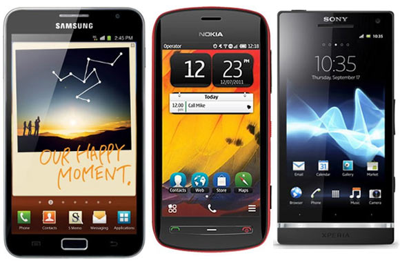
With some brilliant new flagship phones being launched, some of the most powerful phones have shed prices faster than they would otherwise have, making them very good buys.
There is a new ad on TV these days: where a guy says that he is waiting for the next phone to be launched in a couple of months so that he can buy the current one at a much cheaper price. Though the other guy ridicules him, it's not really a bad idea.
In these days of hyper-competition you get a smartphone that was launched at Rs 34,000 at Rs 27,000 about two months after its launch, and even by today's standards, the device remains fairly new. Here are some devices that have gone through such price cuts.
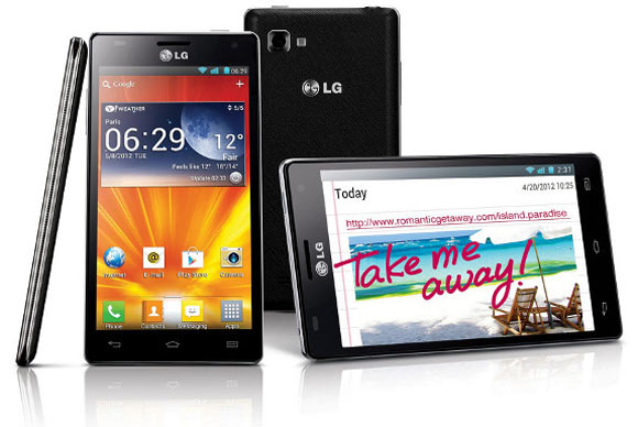
LG Optimus 4X HD
Launched in July for Rs 34,000 and now available for just Rs 27,000, this despite the fact that the phone is very close to Samsung Galaxy SIII in terms of specs, which continues to sell for Rs 35,000.
LG Optimus 4X HD is the flagship model from LG which comes with a 4.7 inch True HD IPS panel touchscreen display with 1280 x 720 pixel native resolution.
Optimus 4X HD houses a quad core 1.5 GHz Nvidia Tegra processor with a low power GeForce graphics chip. For smoother operation of Android 4.0 ICS with Optimus 3.0 UI on it, LG has used 1 GB of RAM. By default, this smartphone features 16 GB onboard storage and a micro SD card slot to accommodate a memory card of up to 64 GB. This smartphone is only 8.9 mm thick and weighs just 133 grams.
In this device, LG has used an 8 megapixel autofocus camera with LED flash. This camera is capable of recording 1080p HD videos at 30 frames per second. There's also a 1.3 megapixel front facing camera for video calling and chat. Other features include GPS with A-GPS, Bluetooth 4.0, accelerometer, gyroscope sensor, support for a variety of popular audio-video formats, stereo FM with RDS, WiFi Direct, and DLNA compliance.
LG has added a 2150 mAh battery to the Optimus 4X HD to make it run longer and support talk time of about 9.5 hours over 3G.
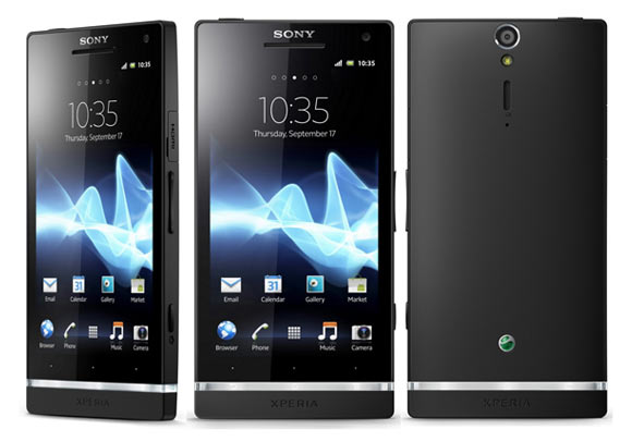
Sony Xperia S
Sony Xperia SL is already available, however, given that the only difference between the two devices in terms of specs is that while Xperia S gets a 1.5 GHz processor, Xperia SL gets the same processor clocked at 1.7 GHz, and therefore there is not much difference in performance. And looking at the price difference of about Rs 3,500 with Xperia S priced at Rs 25,649 vs Xperia SL priced at Rs 29,000 we are inclined to recommend the Sony Xperia S.
Xperia S came with the Android 2.3 operating system and has since been upgraded to Android 4.0. It is also designated to get Android 4.1 upgrade shortly, so even in OS terms you won't miss anything.
Sony introduced its new Xperia NXT series smartphone recently. The all new Sony Xperia S is powered by a Mobile Bravia engine 2.0. It has a 4.3 inch 720p HD touchscreen display and by default runs Android 2.3 Gingerbread. Sony is working quickly to make Android 4.0 Ice Cream Sandwich available for Xperia S.
Sony Xperia S has a 1280 x 720 pixel resolution Reality Display that is powered by a Mobie Bravia engine. Under the hood it houses a dual core 1.5 GHz Qualcomm Snapdragon MSM 8260 processor coupled with 1 GB of RAM. At the back it has a 12 megapixel camera with LED flash that is capable of recording full HD video. This camera has Sony's Exmor R sensor technology that helps it capture quality images even in low light.
On the connectivity front Sony Xperia S features 3G, WiFi, Bluetooth and NFC capability. The Xperia S is an officially certified PlayStation device that will let you download and play compatible games from the Sony PlayStation store. Xperia S packs a 1750 mAh battery that promises about 8.5 hours of continuous talktime.
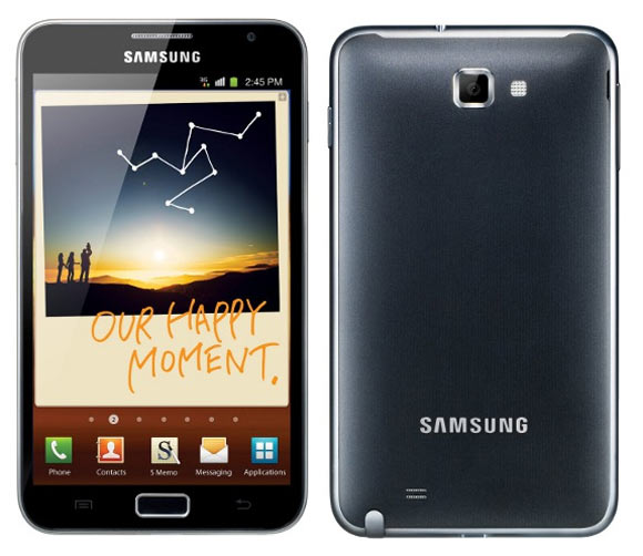
Samsung Galaxy Note
With the introduction of Galaxy Note II, the first version of Note is out of the limelight. However, that doesn't mean that Galaxy Note is not attractive anymore. In fact, apart from a steep price drop Note has also benefited from some of the upgrades that Samsung has provided to bring the functionalities of Note II like the multi screen feature onto the Note. The Note is currently available for Rs 29,000.
Galaxy Note is the first device to sport a 5.3 inch HD Super Amoled display with a native resolution of 800 x 1280 pixel. The phone comes with an S (Smart) Pen stylus that offers a real pen for writing and drawing comfort.
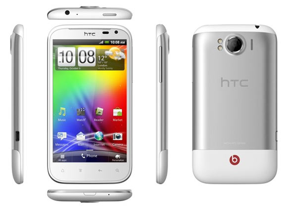
HTC Sensation XL
HTC Sensation XL with a 4.7 inch display and Beats Audio tech with a Beats Audio headset was launched for Rs 37,500 about a year back. The phone's specs are still powerful enough to compete in the high-end range, and it is available at a significantly lower price of Rs 26,000. What makes this device lucrative compared to the HTC One S (which was launched much later,) is the inclusion of a Beats Audio headphone, which in itself is worth more than Rs 5,000.
The Sensation XL features a 1.5 GHz processor and now gets Android 4.0. It is scheduled to get further upgrades.
It features a slim body that is less than 9.9 mm thick. Sensation XL houses a single core 1.5 GHz Qualcomm Scorpion MSM8255T mobile processor coupled with an Adreno 205 graphics card.
The device also has an 8 megapixel camera at the rear with auto focus, LED flash, and the ability to record 720p HD video. At the front lies a 1.3 megapixel camera for video calls and chatting.
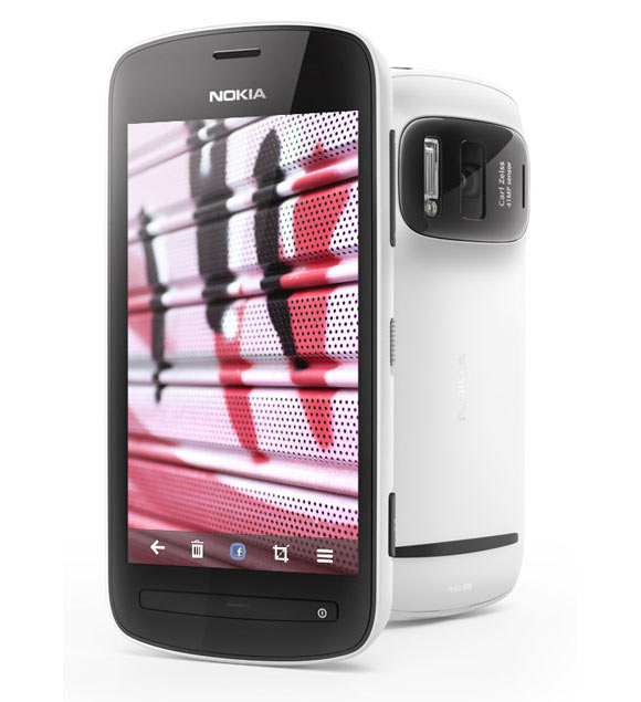
Nokia 808 PureView
Nokia launched its flagship Symbian smartphone, called the Nokia 808 PureView, a few months back. It comes with a 41 megapixel camera, and features a 4 inch Amoled touchscreen display with 640 x 360 pixel resolution. This smartphone's display has been built using Corning Gorilla Glass technology.
The Nokia 808 PureView houses a 1.3 GHz ARM 11 architecture based mobile processor and has 512 MB RAM to run the Belle Feature Pack 1 smoothly.
This Nokia device features a 41 megapixel image sensor which has Carl Zeiss optics that provide the most realistic looking image. The phone features a PureView Pro imaging technology that utilises a pixel oversampling technique to deliver the best and clearest photos. This camera also features the best available Xenon Flash to provide enough light to the optics. While it offers recording at full 1080p HD video, one can also go for 4x lossless digital zoom.
Besides becoming the best camera phone available today, this smartphone also delivers a great multimedia experience thanks to the Dolby Digital Plus mobile chip inside it. Packing merely a 1400 mAh battery, the Nokia 808 PureView also offers stereo FM with RDS, WiFi, Bluetooth, and GPS support. Nokia 808 PureView is available in the Indian market for a best price of Rs 29,500. The phone was launched at Rs 32,000, but it has not shed its price much as it has no competition in terms of camera tech.
In
//
//
Leave a Comment
What Type of Camera Should You Buy?
What Type of Camera Should You Buy?

Saturday 3 November 2012
In
//
//
Leave a Comment
How to Shutdown, Restart or Log Off in Windows 8
How to Shutdown, Restart or Log Off in Windows 8
The regular approach I this. As there are no “shutdown” buttons in Windows 8, you can switch to the desktop view and press Alt+F4 to bring the Shut Down menu or the other option is that you press the shortcut key Win+C, go to Settings – > Power – > Shut down.
That’s too many steps especially when you are in a dual-boot environment and need to switch from one OS to another.
Wouldn’t it more convenient if you could create simple tiles – like any other metro app – and place them on the Windows 8 desktop so that you can Shut down, Log off or Restart your Windows 8 computer with a simple click (or tap).
Enter createButtons.vbs – this is a simple utility (or rather a script) that will automatically add Shut Down and other related buttons to your Windows 8 screen. There’s no installation required – just download the file to your desktop and double-click to create the various buttons.
Also, here’s the full source code of the VB script in case you are curious to know what it does behind the scenes. It may not be the most efficient piece of code but it will do the trick.
'
' This script will create shortcuts in the Start Menu
' Written by satyajeet -
' Web: http://geniusses.blogspot.in/?p=20989
' Version: 0.1
'
set WshShell = WScript.CreateObject("WScript.Shell")
strStartMenu = WshShell.SpecialFolders("StartMenu")
set oShellLink = WshShell.CreateShortcut(strStartMenu & "\Shutdown.lnk")
oShellLink.TargetPath = "%systemroot%\System32\shutdown.exe"
oShellLink.Arguments = "-s -t 0"
oShellLink.WindowStyle = 1
oShellLink.IconLocation = "%systemroot%\System32\shell32.dll,27"
oShellLink.Description = "Shutdown Computer (Power Off)"
oShellLink.WorkingDirectory = "%systemroot%\System32\"
oShellLink.Save
Set oShellLink = Nothing
set oShellLink = WshShell.CreateShortcut(strStartMenu & "\Log Off.lnk")
oShellLink.TargetPath = "%systemroot%\System32\shutdown.exe"
oShellLink.Arguments = "-l"
oShellLink.WindowStyle = 1
oShellLink.IconLocation = "%systemroot%\System32\shell32.dll,44"
oShellLink.Description = "Log Off (Switch User)"
oShellLink.WorkingDirectory = "%systemroot%\System32\"
oShellLink.Save
Set oShellLink = Nothing
set oShellLink = WshShell.CreateShortcut(strStartMenu & "\Restart.lnk")
oShellLink.TargetPath = "%systemroot%\System32\shutdown.exe"
oShellLink.Arguments = "-r -t 0"
oShellLink.WindowStyle = 1
oShellLink.IconLocation = "%systemroot%\System32\shell32.dll,176"
oShellLink.Description = "Restart Computer (Reboot)"
oShellLink.WorkingDirectory = "%systemroot%\System32\"
oShellLink.Save
Set oShellLink = Nothing
Wscript.Echo "Created Shutdown, Restart and Log Off buttons"